Hubway Rides by Neighborhood over Time
Team Members: Aneesh Agrawal, Kenny Friedman, and Katie Marlowe
The data show routes that people commonly take by using Hubways. We want to tell this story because Hubway can be a great alternative transportation for routes that the MBTA does not cover.
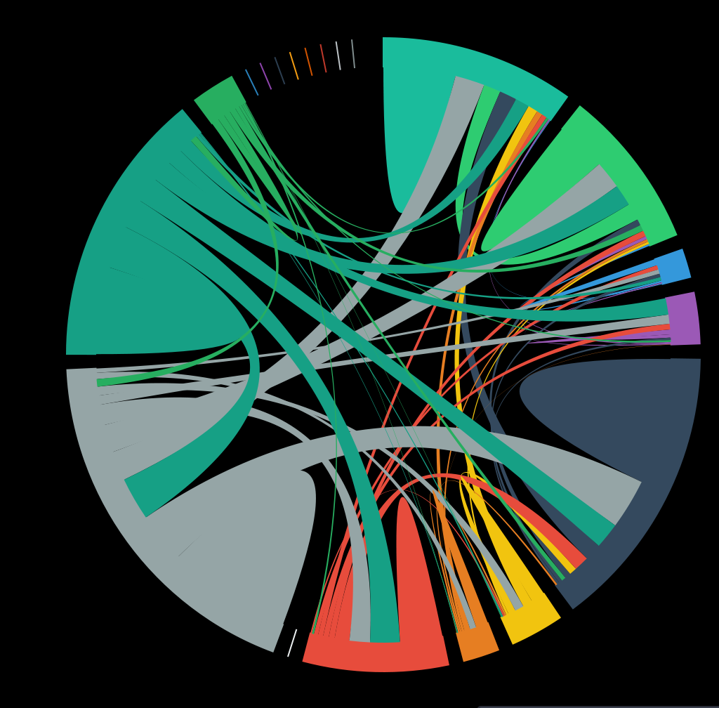
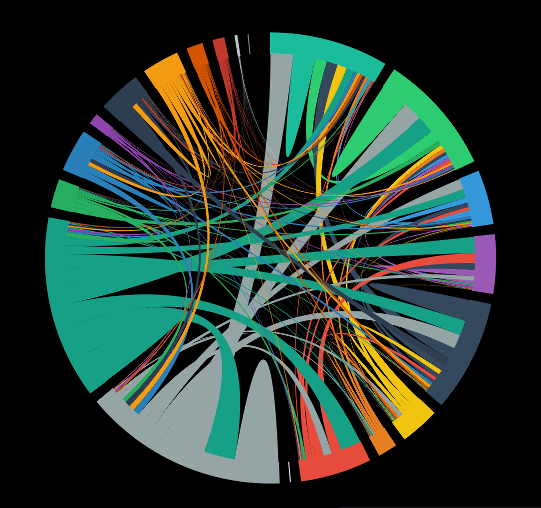
Our data came from hubwaydatachallenge.org, which was a challenge in 2012 to visualize data from Hubway rides. Our data includes information on rides from 2011-2013. We picked a chord chart to visualize this data because this type of chart emphasizes the connections between various stations. The thickness of the chords corresponds to the relative frequency of rides between the neighborhoods. The chord chart points out specific routes that are taken frequently, which leads to the question: Why are people taking Hubways between these stations? Is it because the MBTA does not currently provide a good way to get between these destinations? Or is it just that there are a lot of people traveling between these areas? Specifically, we can look at the blue region (MIT) and the gray region (back bay). There is a thick chord between these areas. We know that it is pretty difficult to get between these areas via public transportation, there isn't a T line that runs between them. This could be a good indication of a route that many people take without many options of how to get between, so many people decide to utilize Hubways.
If you look at the data over time (press the Animate button!), then you can see that some stations didn’t exist at the beginning, but were built in the middle of time this dataset is from. By the end of the timeframe, these stations become about half of overall monthly usage. This points to the conclusion that expanding the Hubway system is effective, and we recommend expanding it further. In late 2015, Hubway did announce some future plans for expansion. We've pulled out data from the month of July 2011 and the month of August 2012 to illustrate these points, screenshots are below.
Note: when you click animate, the animation will cycle through the Hubway data month to month, from 2011 to 2013. Hubway closes during the winters, so you'll notice that the chord chart goes blank at times - these are months where there is no usage because Hubway is out of season.